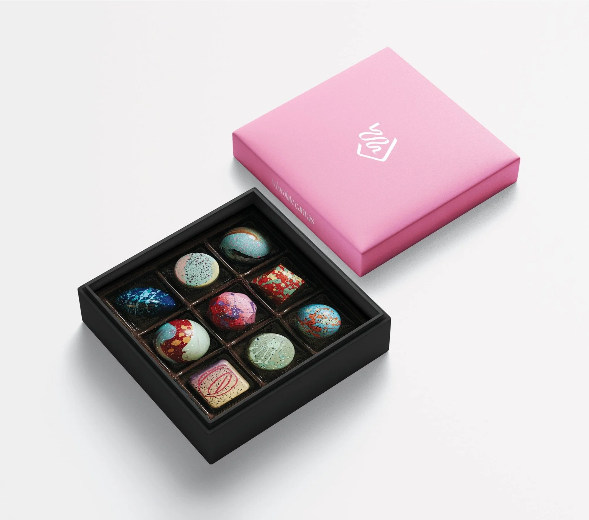
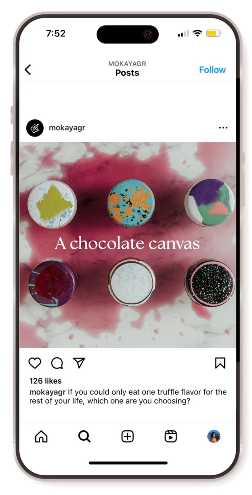
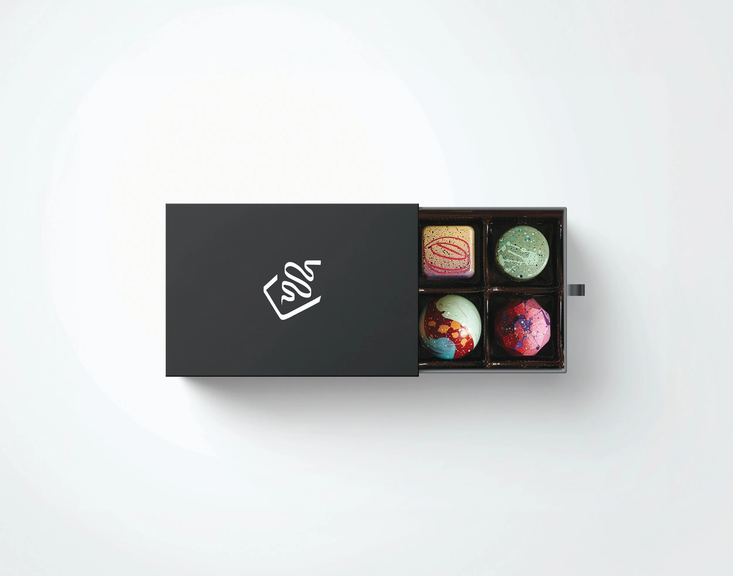
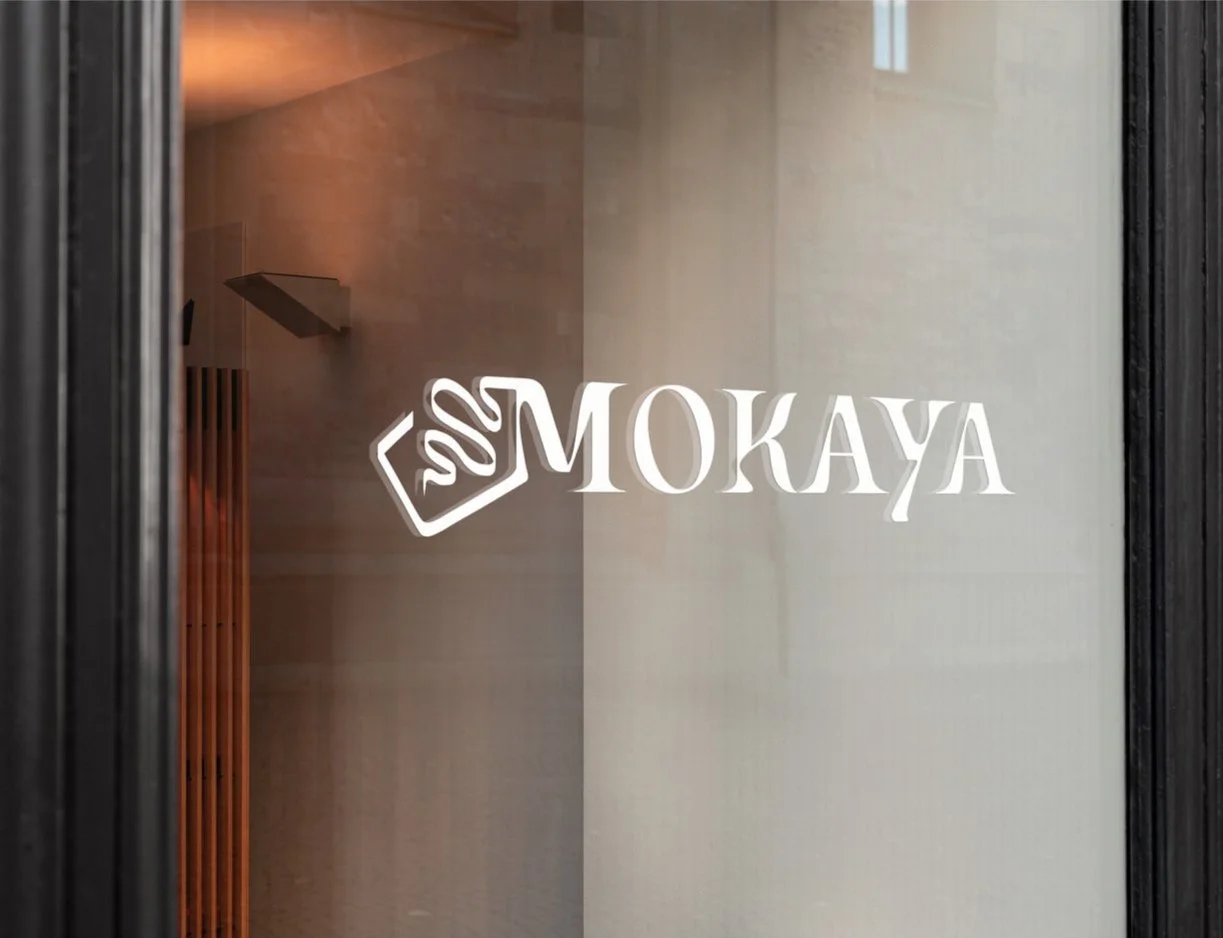
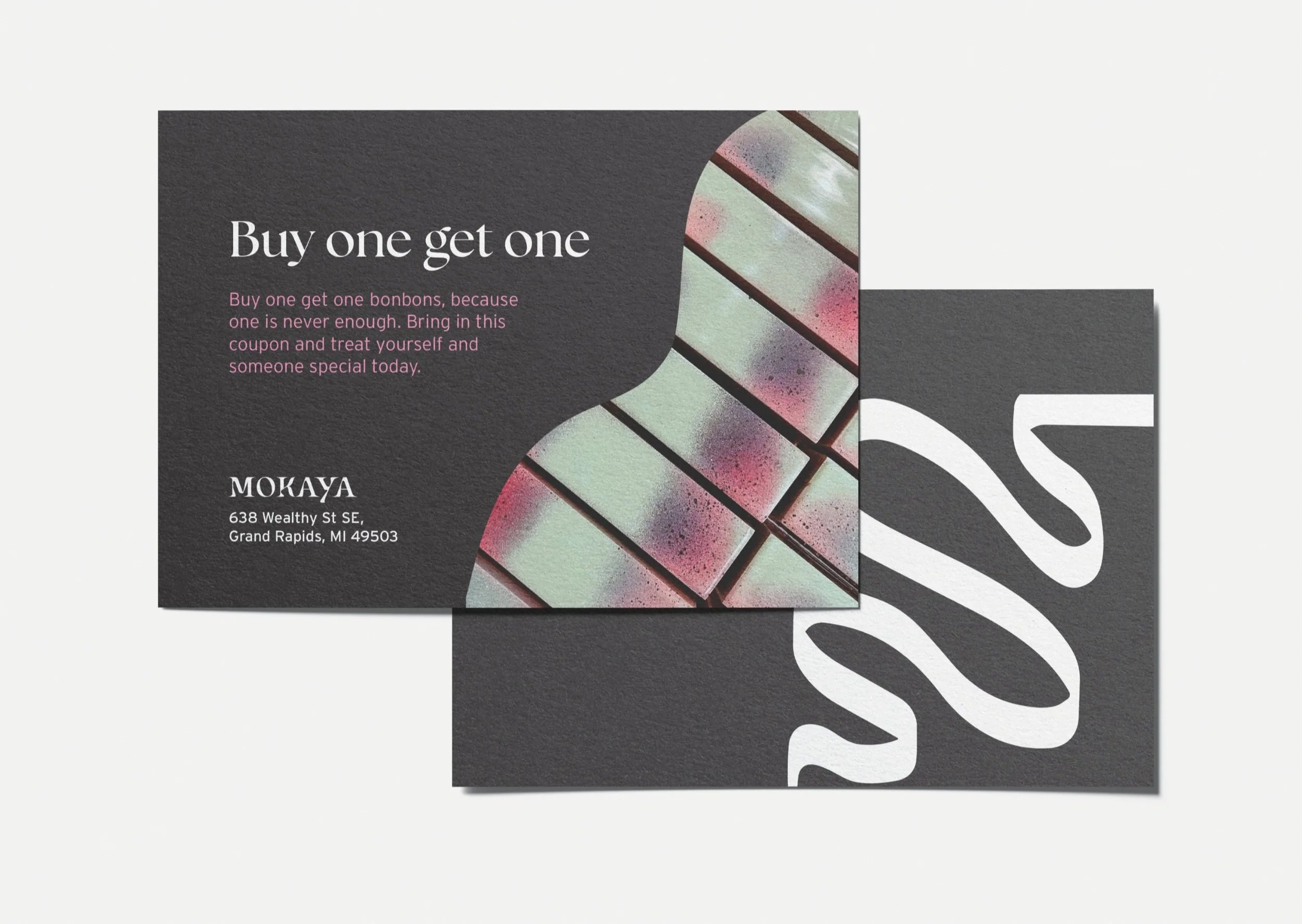
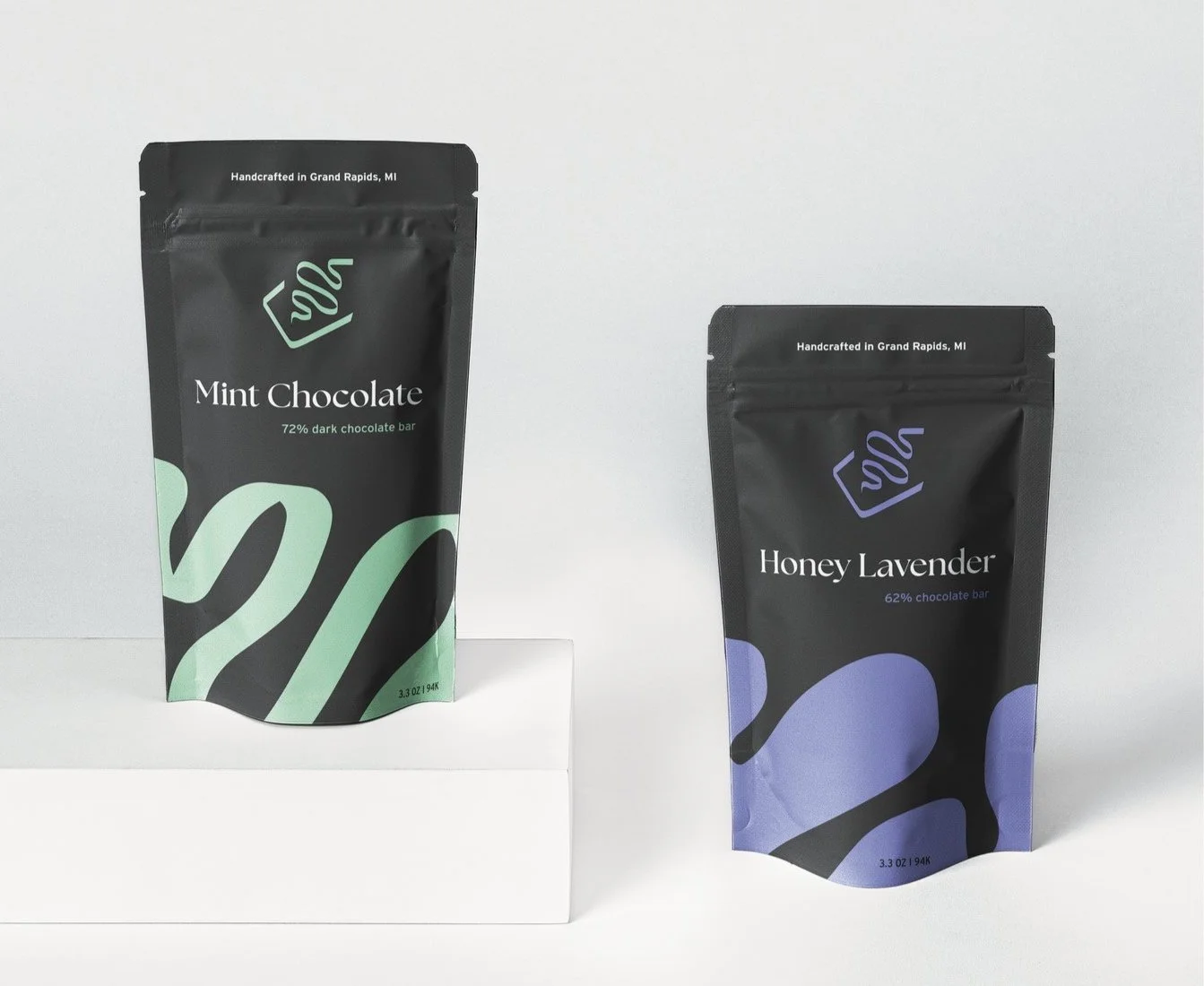
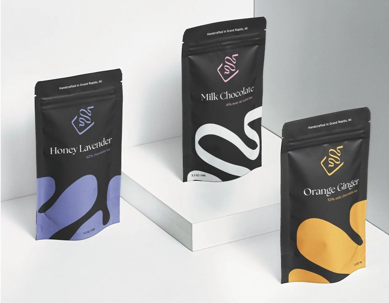
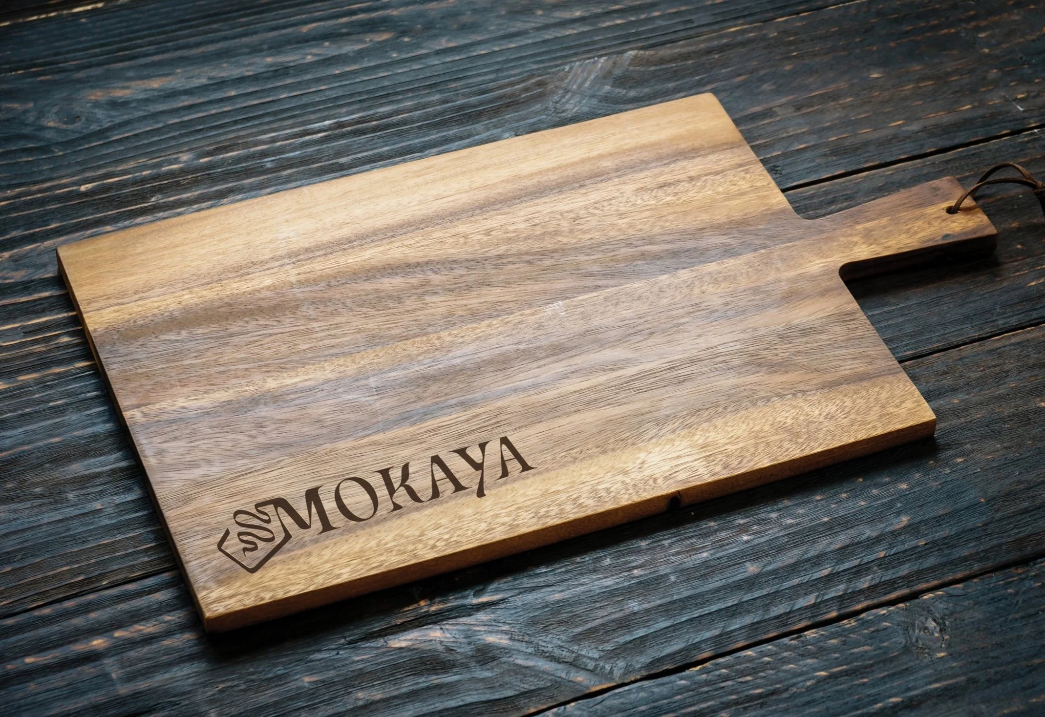
Mokaya is a one-of-a-kind artisan chocolate and confections shop, local to Grand Rapids. I rebranded their current system to elevate the business as well as the experience they provide to their customers. Their mission is to break from the ordinary and the branding is meant to not only reflect that, but to let their products shine, especially because Mokaya’s products are all handpainted, handmade masterpieces.
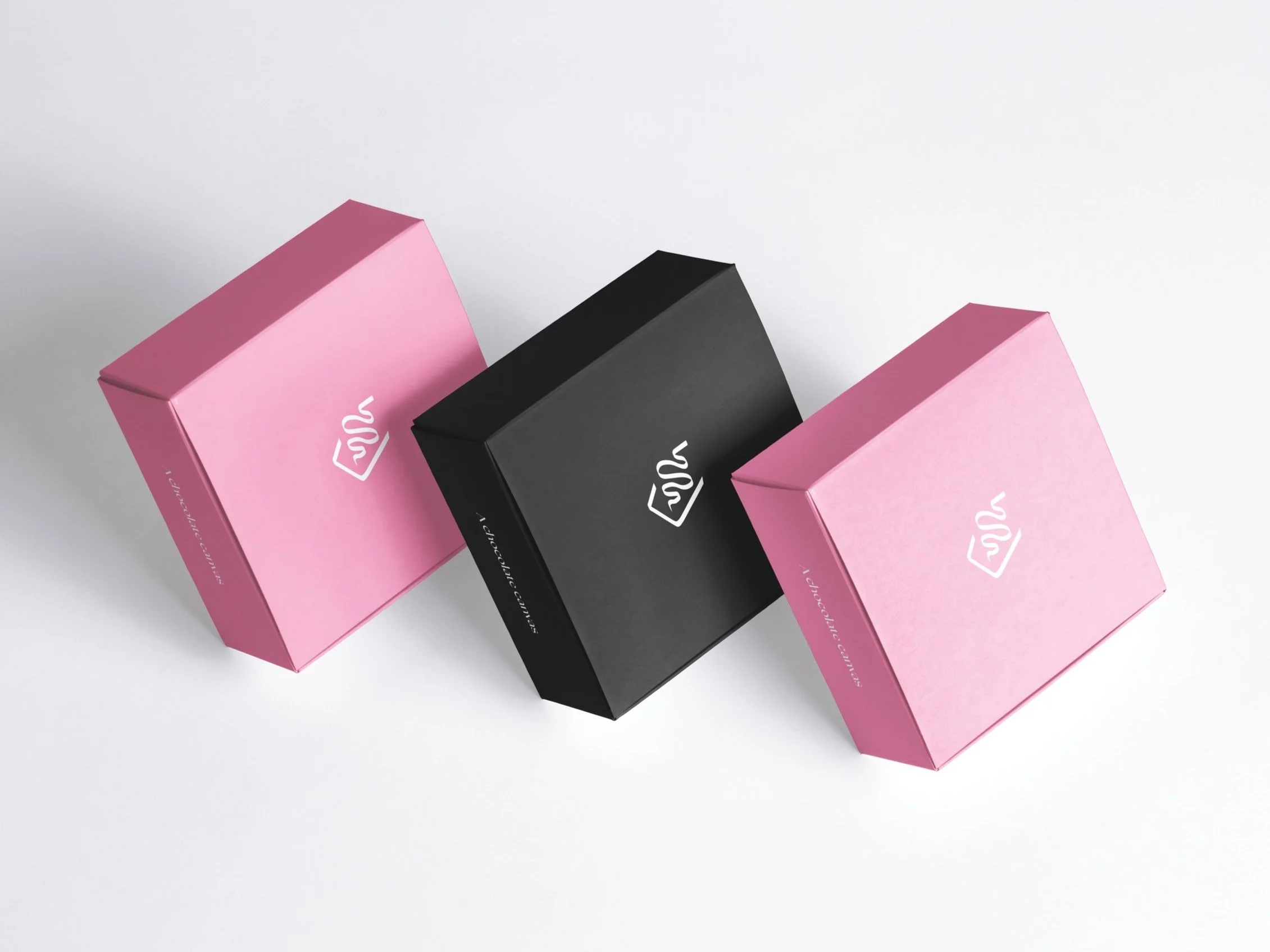
The biggest challenge was creating something that is playful yet sophisticated. The solution is using typefaces that are classy yet organic. The branding is colorful with a distinct, sophisticated, and organized look. Pink is used because it is represents compassion and gives a pop of color while highlighting the products. This rebrand is meant to enhance the customer’s experience, creating an atmosphere that makes them feel special and cared about.
Mokaya Rebrand
Scope
Rebrand
Packaging
Logo
Storefront
Social
Digital
Collateral

